A Warm Home Office Without a Dark Screen Corner
Ask for a warm home office and you often get a brown one. Dark timber desk, heavy shelves, a low amber lamp, maybe a leather chair, all of it looking lovely in a photograph taken at dusk. Then you switch the monitor on. The screen becomes the brightest thing in a dim corner, the timber swallows what light there is, and the room that looked cosy starts to feel like working in a cupboard. Warmth and darkness are easy to confuse, and they are not the same thing.
Warmth in a room comes mostly from materials, colour and texture. Brightness comes from light and from surfaces that reflect it. You can have both. The useful approach is to put the warmth into the things you look at and touch, keep the light generous and clear, and make sure the area around the screen is not the darkest part of the room.
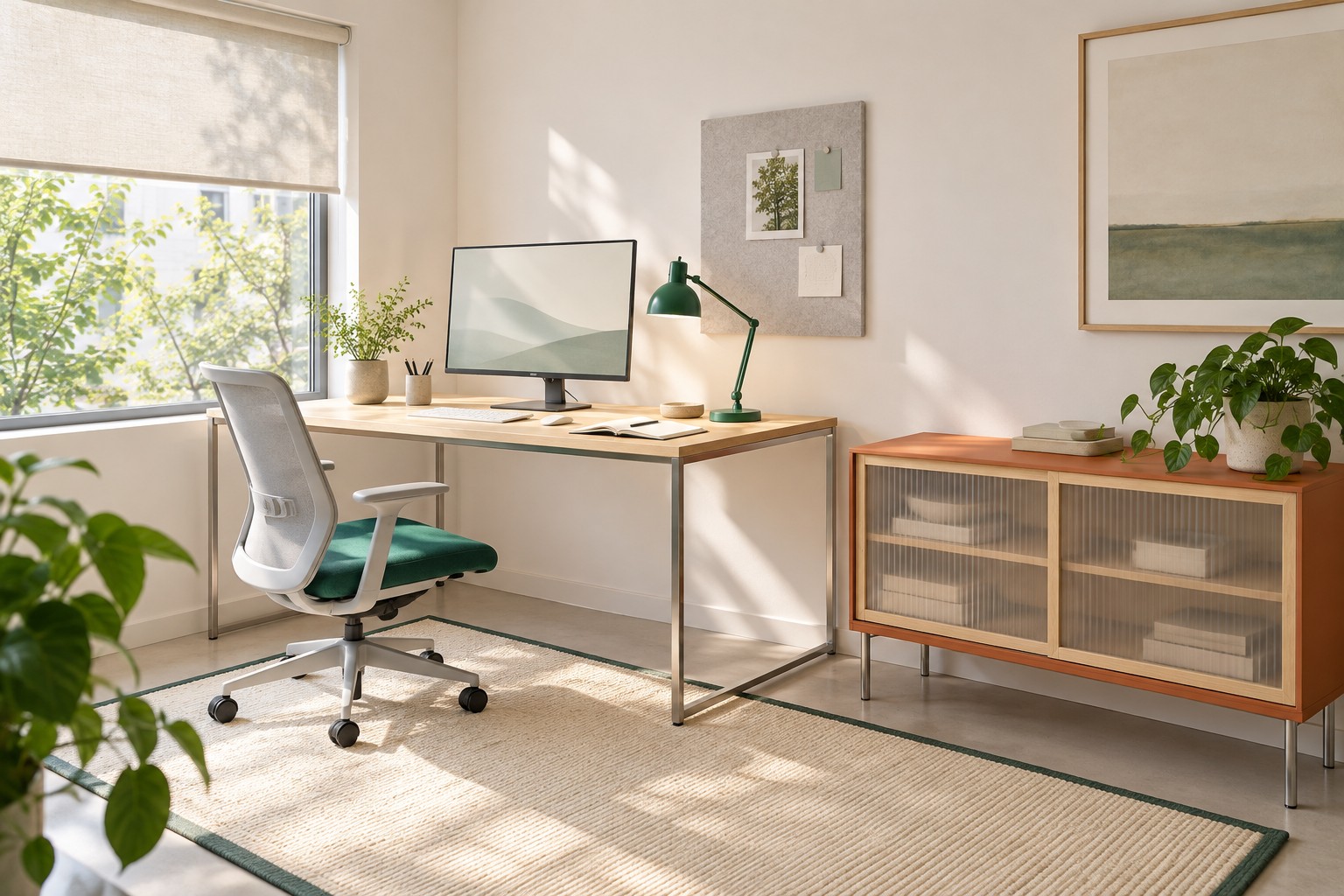
Image credit: pxef.com. AI-generated design concept.
This proposal assumes a room of 3 by 3.4 metres, about 9.8 by 11.2 feet. A desk of 140 by 70 centimetres, roughly 55 by 28 inches, has a light maple top on a thin brushed steel frame and stands against the wall next to a window, so daylight arrives from the worker’s left. Behind and around the monitor, the wall is painted a soft warm white rather than a dark feature colour. To the right of the desk, a low rust-orange cabinet with translucent sliding doors gives the room its main block of warm colour while keeping its visual weight low. A saturated jade chair cushion and a jade task lamp provide the cooler counterpoint. These dimensions and choices are design assumptions for the concept, not a surveyed room.
Start with the timber, because it does most of the work. Pale woods such as maple, birch or ash bring the visual warmth people associate with wood while a pale finished surface generally reflects more light than a dark one; the actual colour and finish matter more than the species name. A light maple top under a monitor reads as natural and inviting, and it does not turn into a dark slab that the screen glows above. Keep the timber where you touch it, on the work surface, and let slender steel carry the structure. That combination is the opposite of the heavy traditional desk: warm where the hands rest, light everywhere else.
Finish matters as much as species. A matte or satin surface softens reflections from the window and the lamp; a glossy lacquer on any colour can bounce bright patches back at you and into the screen. Occupational lighting guidance commonly recommends matte finishes on furniture and equipment and light colours on walls for exactly this reason. In the concept, the maple is proposed with a low-sheen finish, the cabinet is matte and the wall paint is flat.
Colour is the second tool. Warm accents in deliberate places, here a rust-orange cabinet, carry the feeling of warmth without making the whole room dark. Rust orange sits between terracotta and red; it looks rich in daylight and holds its character under warm evening light. Jade gives it something to play against, so the room feels lively rather than monochrome. What this concept avoids is wrapping the walls themselves in a deep warm colour. Dark walls absorb light, and around a screen they create the very contrast you are trying to avoid. If you love a deep colour, put it on a piece of furniture, a door or a wall you do not look at while working.
That brings us to the screen corner. A bright monitor against a dark surround forces your eyes to jump between extremes every time you glance away from the screen, and it makes the screen look harsher than it needs to. Lighting guidance for computer work generally suggests light-coloured backgrounds and avoiding frequent transitions between very bright and very dim areas. In practice, that means the wall behind the monitor should be pale and reasonably lit, not the darkest surface in the room. Warm white paint does this while still feeling soft. It costs nothing in atmosphere and makes the working view calmer.
Texture adds warmth that light cannot take away. The translucent doors on the cabinet catch daylight and glow faintly. A woven seat cushion, a felt pinboard, a linen blind and the grain of the maple all give the eye something tactile to rest on. Japanese design offers a useful lesson here, used directly rather than as decoration: low furniture, slender supports, translucent panels and a restraint that lets a few materials show. The cabinet’s sliding translucent doors and its low height borrow from that, keeping the room feeling open and light.
Daylight is the generous part of the plan. With the window to the worker’s left, light reaches the desk from the side, which suits the screen better than a window directly ahead or behind. A pale roller blind softens bright days without plunging the room into gloom. The maple, the warm white wall and the orange cabinet all reflect that daylight warmly, so the room feels warm at midday without any warm lighting at all.
Evening is where the brown-office habit usually takes over, and where a different approach pays off. Light bulbs are commonly labelled by light appearance, on a range from warm, which looks more yellow, to cool, which looks more blue. Warm-appearing light is fine; it is not the problem. Too little of it is. One small amber lamp in the corner leaves the desk dim and the screen dominant. Instead, combine a task lamp that lights the work surface properly, perhaps with a warm white appearance, and a second light that brightens the wall and the rest of the room so the screen is not the brightest thing in view. Our guide to evening office lighting goes through that separation of jobs in detail, and our window glare guide covers the daytime screen relationship.
It is worth being plain about what colour does and does not do. People enjoy rooms with warm materials and colours, and that is reason enough to choose them. This article makes no claim that orange improves focus or that jade calms the mind. The practical benefits here are about light: pale surfaces reflect it, matte finishes soften it, and a bright screen surround is easier to work beside than a dark one.
There is a compromise in choosing real pale timber for a work surface. Maple is hard, but it still dents under a dropped mug and marks where a mouse travels, and an oiled finish needs occasional care that a laminate top does not. If that sounds tiresome, a pale wood-veneer or warm-toned laminate top gives much of the same visual effect. Compare the specific finish and manufacturer’s care instructions; veneer does not automatically require less maintenance. And if you already own a darker desk you like, keep it. Lighten what surrounds it instead: a pale wall behind the screen, a light desk mat under the keyboard and a lamp that lights the surface properly can rescue a dark desk without replacing it.
A simple test catches most dark-corner problems. Sit at the desk in the late afternoon with the monitor on and look slightly past the screen at the wall. If the wall looks dim and the screen glares, the surround needs more light or a lighter finish. Then try it after dark with only the lamps you intend to use. If the room collapses into a single bright rectangle, add or move a light before you change anything else.
The result should feel warm when you walk in and bright when you sit down. Pale maple under your hands, a rust-orange cabinet doing the job of a feature wall, jade for contrast, a warm white wall behind the screen and enough light in the evening to keep the corner from closing in. That is a warm office you can actually work in.